Wednesday, March 31, 2010

Color

This morning I was interviewed about my ultimate favorite topic....COLOR! Color is the reason I became an interior designer. I love to be surrounded by color and look to color for inspiration on all of my projects.

The article was suppose to be focused on Color Trends for 2010 (boring), but we spent most of the time discussing how to get people to use color in their homes and how to find your personal color inspirations.(much more interesting)

Look for the article in The Cleveland Plain Dealer or at http://www.cleveland.com/ on April 15th. Something to brighten your day a bit after paying your taxes, gulp.

Cheers,
BBS

Monday, March 29, 2010

Color it Spring

I was pleased to find the April 2010 issue of Traditional Home in my mailbox when I got home from work on Friday. I just love receiving my favorite mags at the beginning of the weekend, so I can really pour through them at leisure.


This issue is titled "Color it Spring" and showcases wonderful colorful interiors. There is a house done by Jamie Drake, who is a favorite designer of mine. He has such a sophisticated use of color and is a hoot to see in person. He came to the Ohio Design Centre a few years ago and had us all in stitches. The home he did for this issue is uber traditional, but full of color and a priceless contemporary art collection. I love his mix of silk swag & jabot valances and Andy Warhol's Marilyn in a Prussian Blue Dining Room.


All of the homes featured used color boldly and I just love how there seemed to be a strong presence of this fabulous cerise pink throughout the homes. Makes me want to use it in a scheme soon.....Who's game????
Pick up a copy or check it online at www.traditionalhome.com
Cheers,
BBS

all of the images above are from a home done by Lee Bierly and Chris Drake of Bierly-Drake Inc. The photos were taken by Robert Brantly


Friday, March 26, 2010

Upholstered Beds, Oh My!


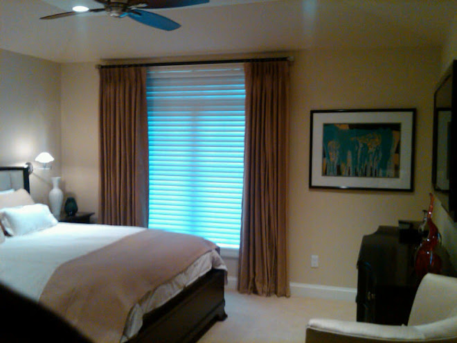
I have been sourcing Upholstered Beds for a new client and I was reminded of how many great options there are now. I have always been a fan of them. They are so cozy and inviting. Perfect for those who like to read in bed and they can really warm a bedroom.
There are so many fabulous shapes! I love how the shape of the one pictured above is set off by the cream linen fabric on that gorgeous wallpaper.
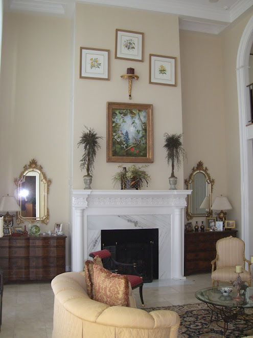
This one sings in red velvet and nail head. The unusual placement of the art is striking, don't you think???
I like the headboards with wings. It is as if your bed is giving you a little hug. If you are considering one of these headboards, be aware of the depth of your nightstand. It needs to come far enough beyond the wings to be useful.
The height and exaggeration of the squares on this bed is wonderful for a more modern feel.
I love the combination of the painted finish, textured fabric, and trim with nail head on the bed above. So sophisticated and yummy. I think I might have a little crush on it.
This squared off headboard with tufting in leather is very masculine and contemporary. I did a similar bed last year for a couple in pearlized white leather and it is gorgeous.
This is a sweet combination of cream milk paint finish and plain textured fabric and would make a charming bedroom.
I love this dressy combination of a french carved frame and rich silk damask fabrics.
Twin upholstered headboards make a wonderful, sophisticated Guest Bedroom.
Or darling children's rooms. The above headboard is my absolute favorite headboard. It is available all sizes and I love, love, love the detail at the tufts. I am dying to use this!!! Hint, Hint, Hint.
And, of course, they are available for dogs as well.


No matter your style, there is an upholstered bed that will fit your look.


Cheers,


BBS

photo credits www.olystudio.com , google image, House Beautiful, Stanley Furniture, photo credit "Reeti", www.hickorychair.com, Lexington Furniture, Oly Studio, Sanderson, Domino Magazine, Kravet Furniture, www.bigdogbeds.com
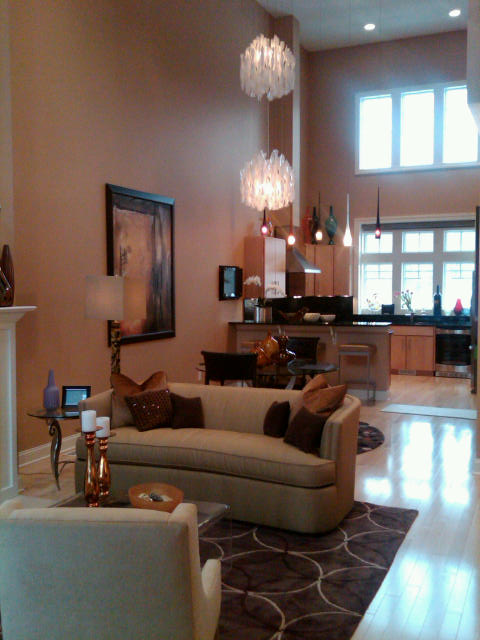
Wednesday, March 24, 2010

Oh, Kitchen Cabinets, What to do?

So...I have lived in my house for almost 11 years now. That is a crazy thought to the girl who moved all the time growing up.
When I moved into my house my Kitchen cabinets were a dark, really dark brown oak. I painted them white as a "quick" fix.
Well, 11 years later they are still there and I have grown bored with the white.


I want to paint them a really fun and unexpected color. My Kitchen is pretty small. It is L-shaped and has bland sage-y green granite counters.(see post from yesterday)


The safe, but still great option would be to paint them a more creamy white. I could add a great tile back splash and change the entire feel of the space.


Or I love, love, love this soft, driftwood gray. My granite looks just like the one in this picture, so I know they would look great together. But I am itching for a little more color. More of a pop.....


Which is why I think I am going with this soft, buttery yellow. Ahhhh. I just love it. Warm, interesting, and inviting. What do you think?


Cheers,


BBS


all images from google image


Tuesday, March 23, 2010

Countertops 101

I am not sure about you but I have grown a little bored by granite counter tops. It is just that they seem to be everywhere (including my Kitchen, so no one get offended) . There are just so many other interesting and great options out there.

Besides the obvious laminate, ceramic tile, and marble, there is Soap Stone. It is a natural stone that typically comes in blacks, greys, and greens.The counters pictured in the Kitchen above are soapstone and they have always been a favorite of mine. While it has always had popularity on the East Coast it is finally moving to the Midwest. It has such a rich look to it and I just love the way it feels.
Solid surface has "come a long way, baby". The counters pictured above are Corian and I love how they wrap down the sides of the cabinets. . This is a big trend right now and is being done with all types of products. It looks so clean and finished. (The kitchen was designed by Patricia Gray Inc.)

Wood counter tops are a wonderful way to add warmth to a Kitchen and especially nice paired with stainless or oil rubbed bronze appliances.


Reclaimed Wood counters are a good choice for Baths or Kitchen islands.


Recycled glass counter tops are just that, made from recycled glass. I love this product because you get such a wonderful range of colors. I have used the "sea glass" mix of colors for Kitchen and Wet Bar counter tops and it is beautiful. This product is available from companies like www.icestone.com and www.vetrazzo.com

Concrete counters are wonderfully diverse in appearance and texture. It can be molded, stained, and polished to have a sleek, modern look or left with pits and rough edges for a more rustic feel.

Bamboo has been sort of the wonder product of the 2000's. We saw a huge surge in using it in place of hardwoods for flooring and that has spilled over to dishes, serving ware, sheets, robes, and counter tops. Bamboo regenerates extremely quickly, so it is sustainable, but also very durable. The product prictured above is from Teragren Bamboo Products.


Engineered Stone has really swelled in popularity for the consumer who likes a cleaner more controlled look. Companies such as www.zodiaq.com, www.viatera.com, www.silestone.com, and www.cambria.com have developed products that are part natural stone, such as quartz, fused with resin. It has the durability of a natural stone with the color and pattern control of a solid surface product like Corian.
The Kitchen above showcases Zodiaq's Bianco Carrera product which looks similar to a white Carrera marble. I, for one, have always dreamed of a Kitchen with Carrera marble counters, but I know from living in a house with one they are difficult to maintain. This is a great sub.

Paper is another "green" option, in addition to recycled glass and bamboo, for counter tops. Yes, I said paper. The top pictured above is made by www.ecotop.com which is a product made from 50%recycled paper and 50% bamboo fiber. It comes in tons of colors and has a smooth, almost concrete or soapstone like look.

Glass has gained in popularity in bathrooms and Kitchens in the last few years. It is beautiful illuminated from underneath and comes in clear, frosted, colors, and textured. It is great in combination with other surfaces as pictured above from www.thinkglass.com .

Stainless Steel. I know some of you may be grumbling that it is "So 50's", but I love the look of it. Commercial kitchens have never stopped using it for it clean ability and durability. Re-visit this old friend, even in combination with another surface. It looks especially good with painted cabinets.
Besides stainless, there are bronze and copper options for counter tops as well.
(Some products mentioned above my not be readily available in your area.)
I hope this was informative and inspiring to you. A dear friend of mine suggested a while back that I share some of my designer in sight and secrets, so I have to credit this to Kristi. She actually asked me to do one on carpet, which is coming I promise, so look for Carpet 101 in the near future.
Cheers,
BBS


images: Google Image, Patricia Gray Inc., Country Living, IceStone.com, Concrete Revolution, Teragren Bamboo Products, Zodiaq, EcoTop, ThinkGlass.com, Bostton Design Mfg.


Monday, March 22, 2010

For the Love of Teal


First, I would like to apologize for lack of posts last week. My computer went to electronic heaven and it was a process to get a new one and get it up and running.

I am loving teal right now! It is hard for me to even except this fact as I grew up in the 80's and really thought I had had my fill of Teal. But it is back and seems fresher, cleaner. Possibly because it is not being paired with rose and burgundy????
The rooms above was done by a designer I admire greatly, Miles Redd. He lacquered the walls which gives them a wonderful glow. I would love to spend a sleepy Sunday in this room with my stack of magazines, one of the 3 books I am reading right now, and a great, endless cup of coffee. (and Oliver of course)

The bathroom pictured above is a perfect example of how you can add a burst of teal in any space. With all of the clean white tile and beadboard it is the perfect splash of color. The hint of yellow is fantastic with it.


This cozy drawing room in rich, dark teal was done by designer Suzy Hoodless. It is warm, inviting, and comfortable. I'm loving the red lamp shade and all of the gold framing with the teal.

This bedroom is so fantastical! It is over the top in all the right ways. I love, love, love the combo of the teal with the orange chinoiserie toile. The room was designed by San Fransisco based designer, Kendall Wilkinson and was featured in Traditional Home.

Here is a shot of the bed wall which shows off the decorative painting on top of the glazed painted paneling. The white shades with black accent are perfection on the teal lamps.

The Dining Room above showcases the striking floral paper from Harlequin. I recently showed this paper in another colorway to my client and just love it. She chose a different paper, but I was secretly rooting for this one.
How gorgeous is that chandelier???
No I charge you to go out and find your inner Teal!
Cheers,
BBS

Photo credits: House Beautiful, Miles Redd, google image, Suzy Hoodless, Traditional Home, Ideal Home.com


Monday, March 15, 2010

Alice is Wonderful

I spent my Sunday afternoon taking in Tim Burton's Alice in Wonderland and I was totally delighted. The sets, the costumes, the make-up, the acting, and the 3-D....all amazing.

The story starts with a 20 year old Alice on the brink of being forced into a marriage she does not want. She panics and races off to think. She comes upon a rabbit who draws her to, you guessed it, a rabbit hole. And she is off to "Wonderland". She has no memory of being there before and has to be reacquainted with her old friends.


Wonderland does not look the same and has suffered terribly since the Red Queen has taken over. This is where Tim Burton's dark touch is magical. He does a fantastic job of showing the destroyed glory of what was once beautiful and mixing it with colorful flashbacks of when Alice visited as a little girl.

The costumes were superb. Colleen Atwood, one of my ultimate favorite people for costumes, designed everything for the movie. You may remember her for her award winning work on Chicago or most recently Nine, among many others.

The scenery, animation, and sets are just fantastic. They really grab you from the beginning and you loose sight of what is real and what is animated. I am not a huge 3-D fan as it sometimes makes me queasy, but it is so worth seeing this movie in 3-D. It is not over the top, in fact it is subtle at times, but it gives such a depth to the scenes.


The acting is incredible. I got completely lost in Johnny Depp's Mad Hatter. He plays the Hatter as fantastic combination of endearing and dark. Helena Bonham Carter, Tim Burton's real life partner, plays The Red Queen and is perfection.

Treat yourself to a movie night. The glasses, the popcorn, the whole thing. Sit back, relax, and be mesmerized by Tim Burton's creativity.


Cheers,


BBS


images borrowed from film are from Disney. Photographs of actors credited to Mary Ellen Mark.


Saturday, March 13, 2010

Spring Indoors

Spring is slowly starting outside, but I wanted to jump start it inside my house. I needed the color, something living, and the fresh smell. I decided to plant some primroses in one of my favorite bowls.
Primroses come in a mix a fabulous colors from bright pinks to whites, purples, and lavenders. They scream Spring and I love them because they are easy to care forand the best part, inexpensive. I planted 4 plants in this bowl and it cost me less than $ 10.00. The bonus they will last twice as long as a vase of cut flowers.

I also needed a burst of color on my mantle. I love these tiny purple flowers. They have a lace-like effect and just spill over the edge of my cache pots.


They look so fantastic against my lime green walls in my Living Room and will get me through these remaining days of Winter.
It is so easy to add some Spring to your home! Get out there and brighten your day.
Now I am off to get Oliver a new Spring collar.

Cheers,
BBS

all images taken by BBS