Saturday, April 24, 2010

Snowboarder's Dream

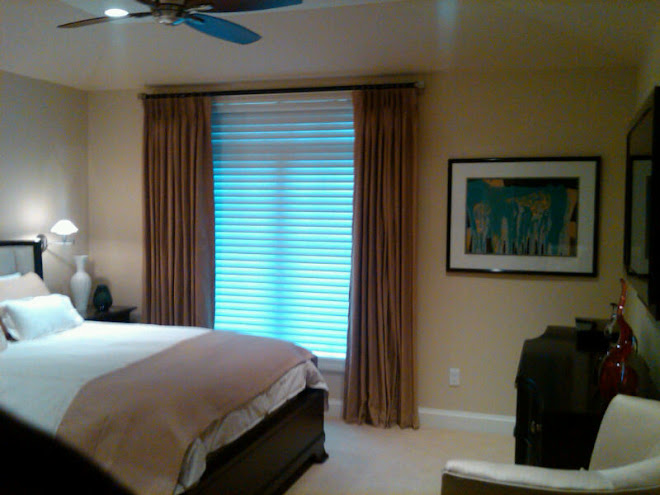
This is the bedroom of the 14 year old son of a wonderful client of mine. They have recently moved into a new home and the son was in on every meeting when it came to the design of his space. It was great to see him so interested and that it was important to him how it was finished.


He gave me a little direction in sharing that he liked snow boarding, skate boarding, wake boarding....you get the drift. And that he loved the color orange. I dreamed up using old snow boards for the cornices above his windows. (And not pictured, we created book shelves out of his old skate boards. No books on them yet, but they look cool.)


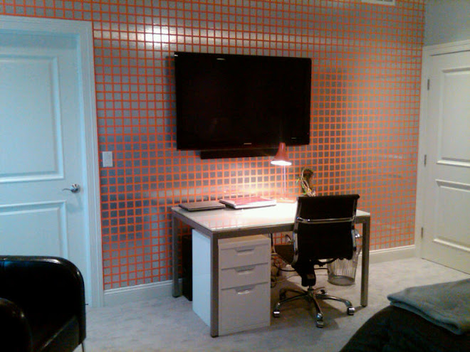
This silver and orange wall came directly from an idea the son had. He mentioned in one of our meetings that he wanted a perforated brushed aluminum wall with orange behind it. Pretty cool idea for a 14 year old boy.


Due to size and budget constraints(it would have been obscenely expensive), I came up with the idea of painting the one wall this great orange (Sherwin Williams Robust Orange) and having a sign person cut squares out of brushed metal looking contact paper. It really turned out great.


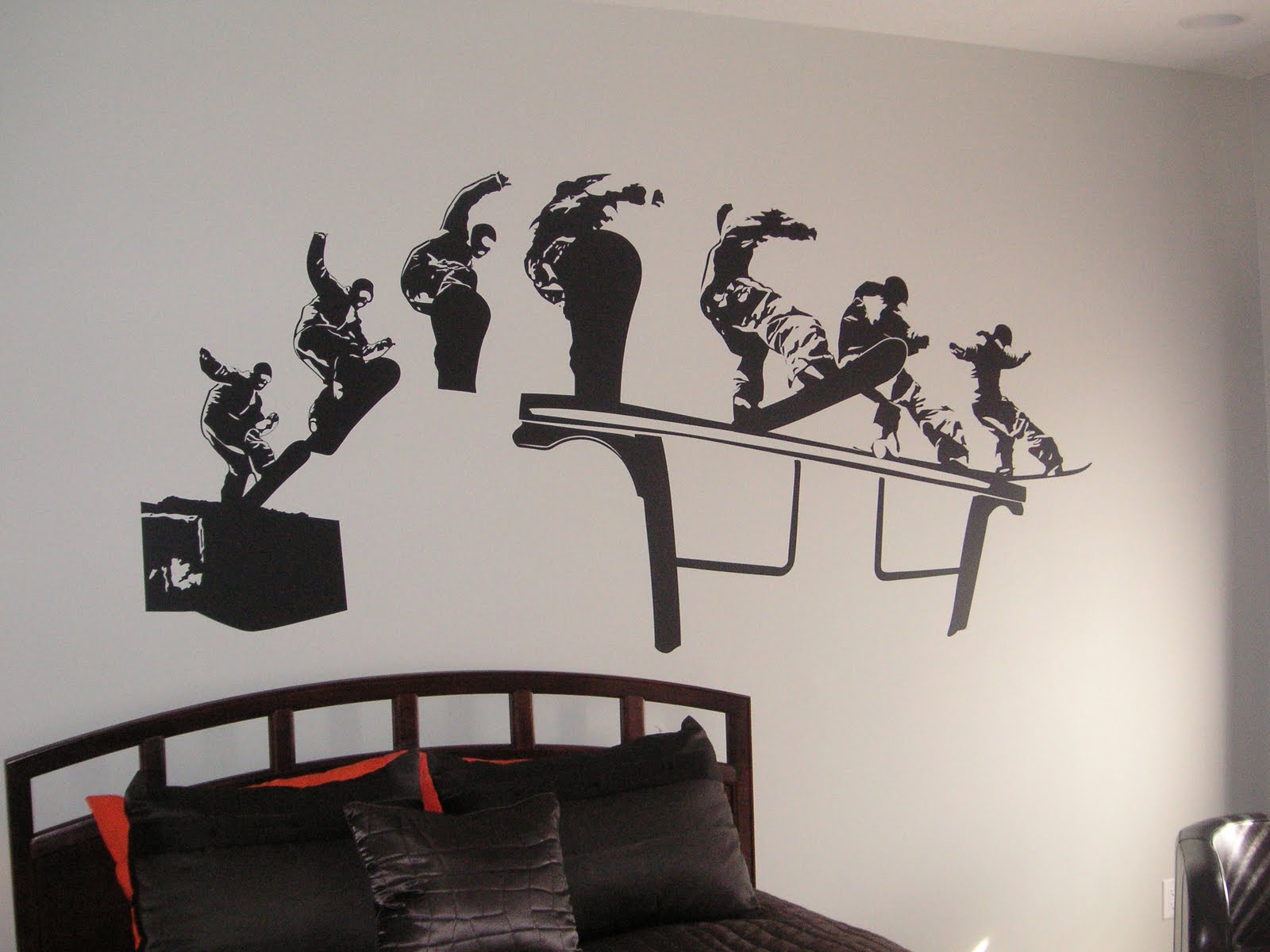
The final touch to the room was kept a surprise to the son by his father and me. It was a 110" wide snowboard mural decal in black to go above his bed on the silvery grey wall. It was not without challenge. No matter how easy, breezy the instructions say it might be, it was a bear.


The first one met it's demise by breaking away from the tape and sticking to its self. Nice! It was like a giant ball of contact paper when we were done. Just a disaster.
I ordered a new one and for the second go we brought in the professionals. My guys who paint and wallpaper. It was even difficult for them! But it is done, and I love it.

The best part, so does my client! He may be 14, but he sure knows what he likes....


Cheers,
BBS
all images from my camera and if you so choose, you may borrow them.


Friday, April 23, 2010

Pouf, The Magic Moroccan????

The Moroccan Pouf is popping up in the most unexpected places. I heart these colorful leather ottomans.
They are so perfectly unexpected in a classic setting. I just love the burst of color in this neutral space.

They make the perfect extra seat to pull up for company.


Great for the "kid-lets".


I am mad for the silver ones.


And the limey green....


Oh, who am I kidding....I love all of the colors.

They are perfect for your teen's bedroom.


Or a glamorous Living Room. It adds an exotic touch to an Old Hollywood space.


Want one????? Check out www.johnderian.com or www.tazidesigns.com for options. (They range from $220-375 on these sites depending on color, stitching, size)


Get out there and add a little Moroccan Madness to your home.
Cheers,
BBS


images from Google Image; Elle Decor, The Lennoxx, Caitlin Moran, Tazi, John Derian.


Wednesday, April 21, 2010

Nautical Inspiration

Living in a town on the shores of Lake Erie with an active yacht club, many of my clients are boaters. They often want a slight, very slight, nautical influence to their homes, so I am always looking for inspiration. It is a delicate balance of adding hints of it, without looking youthful or staged.


I have been collecting images for years and I have always loved the staircase above. The use of the cleat and line is so unusual and creative.


I love this Nautical themed restaurant by Hamish Robertson. It is creative and whimsical, yet still very sophisticated. I would love to know where it is, so I could dine there. Anyone know?


Notice the cabinet hardware as it looks like a Galley kitchen on a boat.


Great use of a brass porthole on the door.


I love these!


The Captain's chair and ladder are nice touches along with the classic red, white, and blue.


I have used nautical charts as wallcovering in baths before and it has a wonderful feel.


I love it in this bedroom.


Great light fixtures and what a wonderful rug. The design firm who did this home, Diamond & Barretta, are known for their custom designed and often unusual rugs. This one is just beautiful.


The model sailboat adds a dash of nautical to this coastal feeling room.


I want one! What a great way to keep a door propped open in a Summer breeze.


The teak and holly floor is stunning and that barrel ceiling. Wow, what a Billiard Room.


This pantry in Elle Decor has such charm.


I love the colorful painted bookcase and all of the treasures displayed on it.


Looks like a boat! What a great place to have coffee and read the paper.


The crispness of the navy, white, and red is fantastic.


This painted floor is just beautiful. I love it paired with the navy woodwork.


Check out the light fixtures above the mirrors.


I love the coastal feel of this bath. It is classic and modern all at once.


The use of the line as a towel holder and chart wallcovering are great.


A ship's wheel sink. So creative.


A "ship" bed for a Boy's Room. Who needs a race car bed when this is available???


I love this use of a sail as a slip cover for this headboard. So fresh and I love the transparency.


Look at the compass rose painted on the ceiling of this child's room.


Adorable! Teak and Holly floor, check. Great bedding, check. Window seat, check. Ship's ladder, check. It is the perfect Bunk Room for a vacation home.


A modern take on the same idea. I really like the light fixtures and "shutters". Great color gray as well.


More bunk beds. Great use of contrasting bead board.


Simply perfect.


Hope you enjoyed this Nautical adventure.


Ahoy,


BBS


images from Coastal Home, Coastal Living, thelennoxx.com, Suzanne Kasler, Matt Albiani, Domino Magazine, Laura Casley interiors, styleathome.com, Herlog Architects, Ideal Home, Elle Decor, Met Home, flickr, Diamond & Barretta, Hamish Robertson, buythesea.com, House to Home UK and all were taken from Google Image.


News from High Point

It is the High Point International Furniture Market this week and sadly we did not go this time.

High Point can be daunting. It is a city the size of Akron, Ohio with 130 or so expo buildings that are open only 2 weeks a year for the furniture market. It would be similar to parking your car downtown and thinking I have 5 days to go through every building down here and try to see as much as possible. It is laughable. We work really hard, long days and cover maybe 5-10% of the market.

But Market is a blast. It is so inspiring to go through the showrooms and be introduced to the new products. There is so much creativity flowing through the hallways and in the spaces. I just love it. I always come home with oodles (yes, oodles is a word) of fun ideas.

This year I am experiencing High Point through the modern convenience of Twitter. It has been really great to hear from other designers, furniture makers, and magazine execs on their impressions of the hot trends, what is exciting them, and of course, who is having the best parties. (Actually far more important than what is in the showrooms. Let's be real.)

Take this info for what it is, a fun insight into HP, but none of it is first hand.

*It sounds like nature is everywhere. StudioM_ on twitter described what she was seeing as "Au Natural Chic" and that there was burlap, turtle shells, and driftwood galore. (Love That)

*I wish I could remember who said this on twitter and I have tried to go back and find it but, "Gray is the new beige". Such a fab statement and I am seeing this all around me in Cleveland too.

*Bold colors on accent walls are being shown through out the showrooms. Raymond Waites was quoted as saying he is only using, "happy colors", for his collection at Lane Venture.

*A big trend at all price levels seems to be the Napa or "French Laundry" look. Classic, yet a bit rustic.

*Lots of reflective surfaces and silver, silver, silver, silver.

There are typically a few hot color combinations that come out of market. All I have heard so far is gray mixed with either citrine, eggplant, or fuscia.

Love them all!

I will be keeping my nose close to twitter for the next few days. If you are on twitter and would like to follow along with the fun, type #hpmkt in the search box. (I have found some great people to follow this way)

Cheers,

BBS


image is from Google Image and is of the GIANT chest of drawers that welcomes you to High Point, NC. It always makes me giggle when I see the socks.

Tuesday, April 20, 2010

Martha moves Home

Last evening I stopped by my local Home De-Pot (as I like to call the Depot) to check out the new Martha Stewart Living paint collection they added last week.
I have to say I was really impressed. At first blush, the colors seemed limited. Maybe only a few hundred over all, but upon closer inspection they are absolutely all usable. I love them all.

She has taken the best colors from her previous collection for Sherwin Williams, tweaked them a bit, and added many new ones. (If you have a favorite color from her past collections do not trust that although named the same, it is. For instance Duck's Egg is back, but it is greener and deeper.)
I am absolutely in love with a soft, blushy pink called Ballet Slipper Pink which I have been carrying around the studio all day. I am obsessed with it. It is exactly the color of a worn ballet slipper. A possibility for my Guest Bedroom????
There are many grey tones and soft blue-greens. She has also included some punchy colors like watermelon and beet.
Check out the samples the next time you are at the Depot. I think you will be impressed.
Cheers,
BBS


All images from Google Image.

Sunday, April 18, 2010

Ikat; Trend or Classic?

While I was paging through my May 2010 issue of Elle Decor, I was surprised to stumble on Ikat as their Trend Alert. It seemed to me they had alerted us of this "trend" before...
So, I went to Google (what did we do before search engines???) and sure enough, it was their Trend Alert for April 2008. So I am wondering if Ikat is still a trend, or has it become a classic?


It can be clean and simple as in the above bowl.

Or set the tone of the room as it does in this bedroom.


I love how these walls jump with the Ikat pattern. It takes a tiny bedroom and makes it unbelievably interesting.


I love how these eggplant Ikat tufted chairs set off the other subtle tones in the room.

And how the navy and white of these Ikat patterns have a cooling, calming affect.

This single pillow lifts this classic room.

Or gives this highly formal space some whimsy.


I love this classic Bergere' chair in the Ikat pattern.

Or on this French settee. So unexpected.

Eddie Ross used Ikat pillows to complete his window display for Bloomingdale's this winter. His fantasy client was a working mother who traveled the world. I love the idea that "she" had brought these pillows home from one of her exotic trips.


Look how wonderful these drapery panels are on the set of A Single Man. The character, Charley's Bedroom is as fabulous as she is.(See my post about A Single Man)

I love how this rug looks with the simplicity of the clear chairs and black table. (Available from CB2)
So the question remains, Is Ikat a trend or a staple? I am not sure, but I hope it is here to stay. I love the exotic whimsy it adds to any space.
Cheers,
BBS


images from Google Image and Domino, Elle Decor, Lee Jofa, CB2, Michael W. Smith, A Single Man, Eddie Ross,