One of my "tricks up my sleeve" as a designer is to use wallpaper in creative ways. Even when wallcovering was a naughty word, I could usually convince my clients to use it sparingly.
 The Closet. One of my favorite ways to use it is in a closet! It is so decadent and unexpected. I especially like it when used in a nook or cubby of a closet.
 Or gracing the walls of an elegant dressing room like Aerin Lauder's chic' Chinoiserie wallcovering in her "closet".
 I think this home office/craft room is adorable and fresh. What a great use of an extra closet. And the brightly colored floral is so whimsical with the aqua painted desk and doors.
 This was Tinsley Mortimer's Upper East Side closet adorned in Scalamandre's blue and white toile with Chinese dragon. It is a tight space, so I love how she played it up by using a bold pattern.
 The chandelier paper in lipstick pink is great in Miley Cyrus's Dressing Room. I have used the paper in black on black in a Powder Room and the scale of the pattern is fantastic.
 This may be one of my favorite papers and I think it looks so chic in this closet.
 And another view....
 The bookcase. I often talk to my clients about accenting the back of bookcases with a contrasting color, or better yet paper. This is an inexpensive trick as it usually only takes a roll of wallpaper and can be self-installed with ease if need be.
 It is a great backdrop to books, accessories, or better yet, left empty.
I love how this damask pattern, from Laura Ashley, matches behind all of the shelves. It adds an elegance to a plain bookcase.
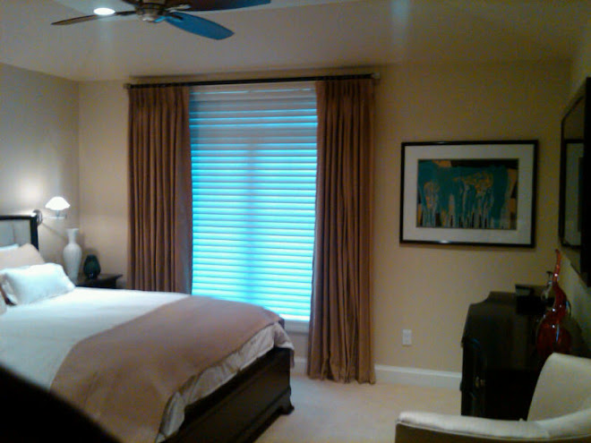
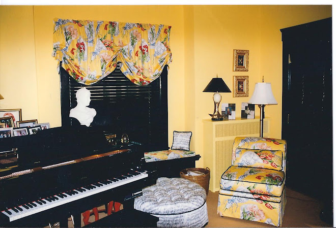
 This paper highlights the soft, blush pink of the upholstery and adds some pattern to the room.
 I love the contrast of the colorful paper on the dark paint. So rich.
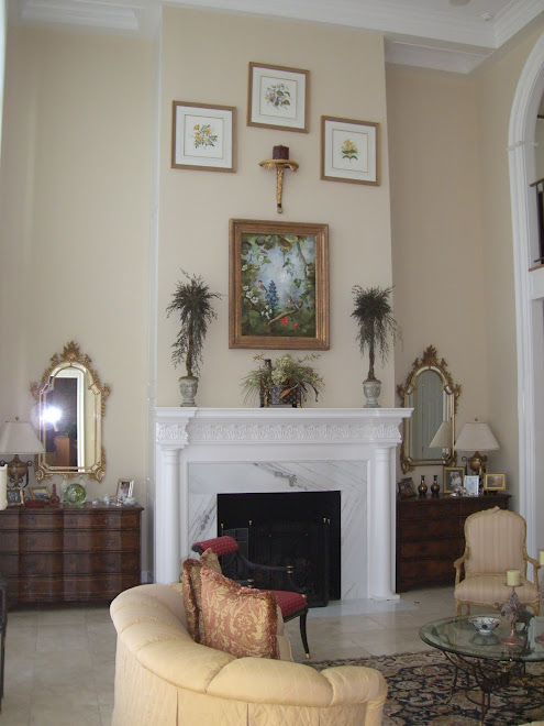
 The Ceiling. In my opinion the most undervalued surface in the home. I love to paper them. Always have.
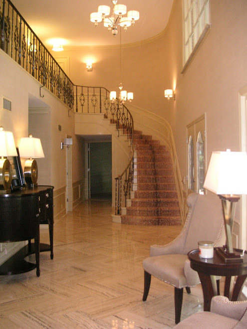
 It adds warmth and unexpected pattern to the space. I especially love the paper used on this entry ceiling. I love how it ties in the window treatments and compliments the artwork. If it was used on the walls it would fight the art, but not on the ceiling.
 An even bolder approach is to paper the walls and ceiling in the same paper as in this room. This paper, from Osbourne and Little, is flocked on top of metallic background so it has a lot of texture, depth, and reflective qualities.
 Another paper from O&L that I have used many times on ceilings. It seems to call for it with its starry feel.
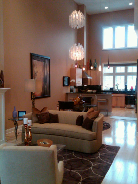
 The Feature Wall. I struggled with if I should include this in the post. When it is done well, as in the picture above, it is perfection. But when it is done poorly, well you know where this is going.
There needs to symmetry and a purpose for doing it.
It can not be a decision based on finances. The, "I love this paper, but I can't afford to do the whole room so I will just do one wall" use is often obvious and a failure. I would rather my client wait until they can invest in it or use the pattern in fabric for a pillow somewhere.
If it is done right, it can be magic!
 It allows the opportunity to use a much bolder pattern than you would otherwise consider and create real excitement.
 When done right, it can make the room.
*******************************************************************************
Thank you for letting me wax on about wallpaper for 5, count them, 5 posts. I have made my Argument for Wallpaper, now I hope you have found some inspiration and courage.
I would be remiss if I didn't include a list of my Go-To wallpaper lines. There are tons of them, but these are some of my favorite residential companies.
Anna French http://www.annafrench.co.uk/
Brunschwig & Fils http://www.brunschwig.com/
Cowtan and Tout, Colefax & Fowler, Jane Churchill, and Larsen http://www.cowtan.com/
D.L.Couch www.dlcouch.com
Harlequin http://www.harlequin.uk.com/
Osbourne & Little http://www.osbourneandlittle.com/
Romo http://www.romo.com/
Sanderson http://www.sanderson-uk.com/
Scalamandre http://www.scalamandre.com/
Schumacher http://www.fschumacher.com/
Thibaut http://www.thibautdesigns.com/
Zoffany http://www.zoffany.com/
All are available through designers and if you saw any papers that interested you through out the posts, I would be happy to provide samples and pricing. Just ask.
I hope you enjoyed this insight into the possibilities of Wallpaper.
I hope you enjoyed this insight into the possibilities of Wallpaper.
I am off for a little R&R in the sun. I may post, if inspired, while gone or I may be too wrapped up in cocktails at the pool, lunch with friends, walks on the beach, hours with my nose in a good book. You know the drill.
I be back to posting for sure May 11th!
Cheers,
BBS
all images from Google Image and include Elle Decor, Southern Accents, Veranda, Harper's Bazaar, House Beautiful, Real Living, Traditional Home.
all images from Google Image and include Elle Decor, Southern Accents, Veranda, Harper's Bazaar, House Beautiful, Real Living, Traditional Home.


+013.jpg)